Hashtag Café
Location: Shanghai, China
Area: 220 sqm
Status: Complete
Completion: March 2020

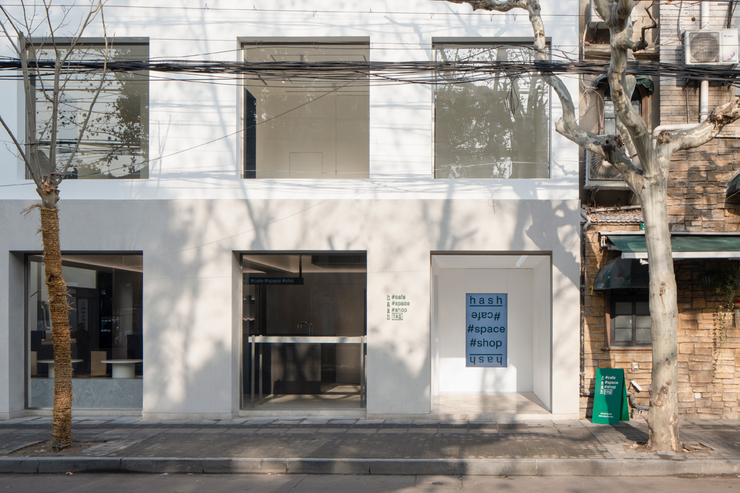
The building is located on a street that is lined with plane trees in Xuhui, Shanghai. The interior of the building has gone through a project that has completely transformed this brick-concrete building of the 1980s into its modern view. The building has two floors with a total area of 200 square meters. Before the renovation, this building was a two-story brick-concrete building that was used as offices. As an important part of the French Concession business district, the Yongjia Road and its surroundings are working as a more engaging and integrated platform for the city’s daily consumer life.
The owner of the space aims to manage an independent space in this vibrant environment. Therefore, the owner creates this unique space whose function is extendable and redefinable. HASHTAG # cafe # space # shop is a comprehensive living space that combines a cafe, an exhibition venue, a bar, and a retail shop. The words #cafe #space #shop are three of the best terms used to define this site.
The first floor of the original building protruded slightly from the ground floor and entered the back of the building through an inconspicuous straight staircase. The renovation team first reconsidered and redesigned the volume and the proportion of the building with a minimal touch, indented the second floor of the new building, making the ground floor protrusive and forming a trapezoidal shape. The change of the proportion not only reduced the sense of oppression of the first floor on the street but also made it easier for passersby to look into the windows and have an idea of the activities that take place on the first floor. A hidden drainage ditch is set at the top of the protruding ground floor, which ensures a clean facade and brings a certain sense of strangeness to the project site. The protruding ground floor could be easily sensed, but it does not have any actual working function, such as being a balcony. The design team aims to create uncertainty in the guests’ experience from such alteration. (Relationship between exterior design and the city).
To adapt to the flexibility of the function and ensure the structural safety of the building, the renovation team reinforced the foundation and the beam of the original building, supplemented the construction column at the opening, and re-cast part of the floor slab. The new structure is more like a restoration of the original building rather than a renovation. Due to the regulations of the City Management Bureau, the renovated building cannot hang signboards outside the building. Therefore, the team planned a small room at the right end of the ground floor as a parlor where the public could have access to the building. The parlor could not only display the signboard and exhibition information via LCD screens and posters but also provide a covered, semi-open space for guests to shelter from rain and for short stays.
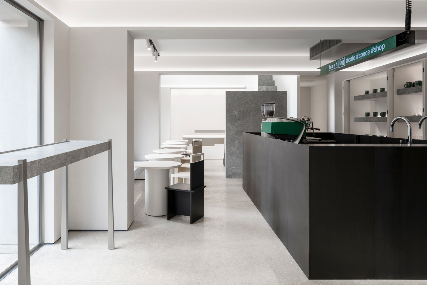
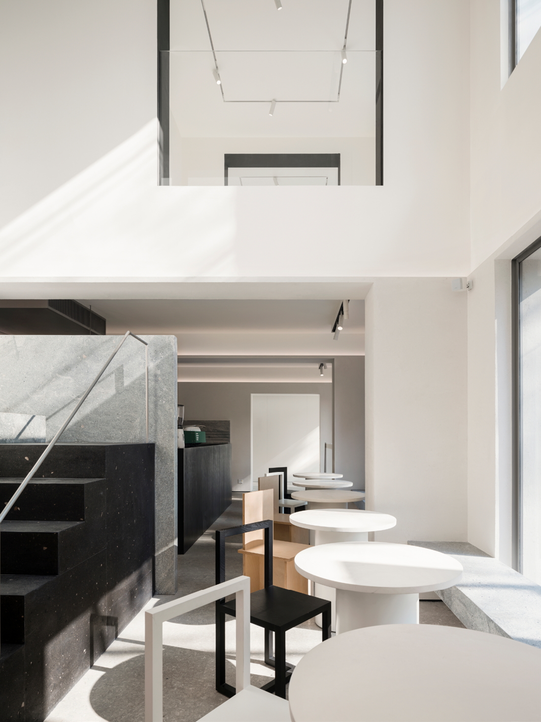
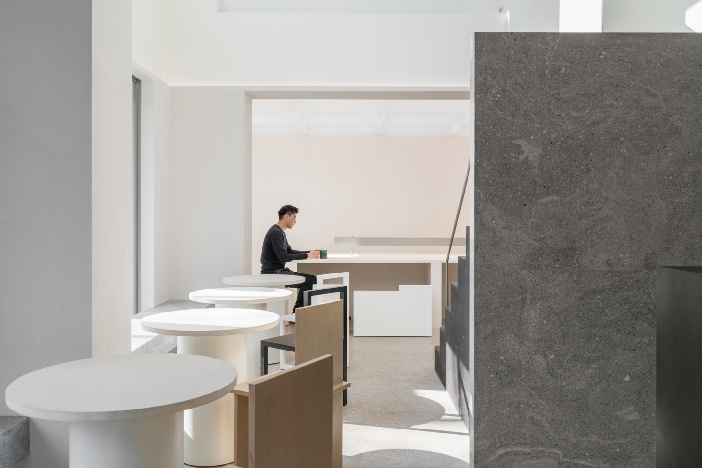
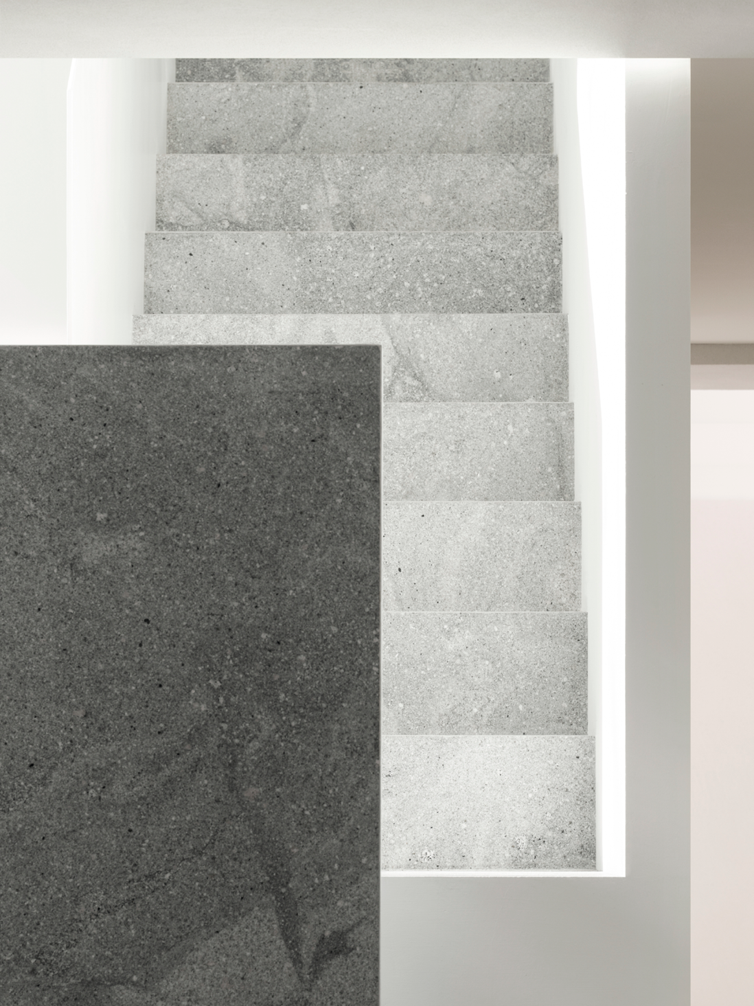
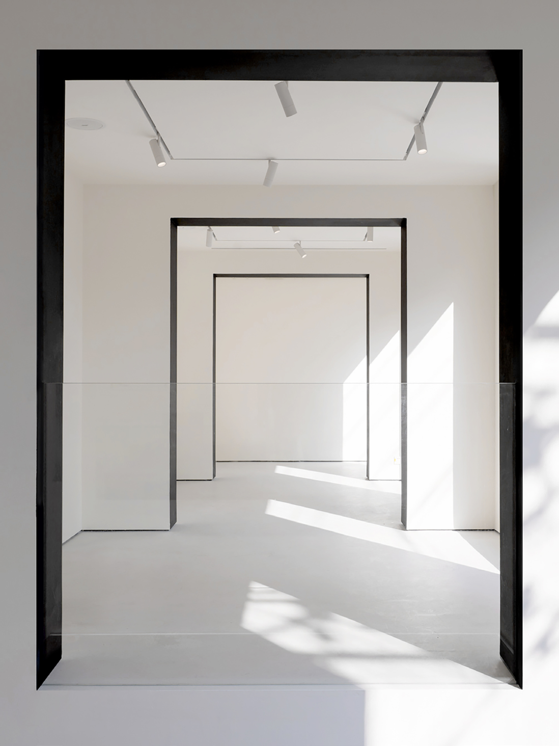
The renovation preserves the stairs of the original building as a logistic passage. At the same time, the design team aims to provide a visually tall space between the two horizontal levels, which not only forms a difference in scale but also increases the size of the scenery that the guests can see from inside the building. Additionally, this design could also cope with the flow of guests going up and down the stairs. From the bottom to the top of the stairs, the design team has used three colors, from black volcanic rock, and gray granite to white paint. The color scheme of the staircase also corresponds to the palette of the façade of the building.
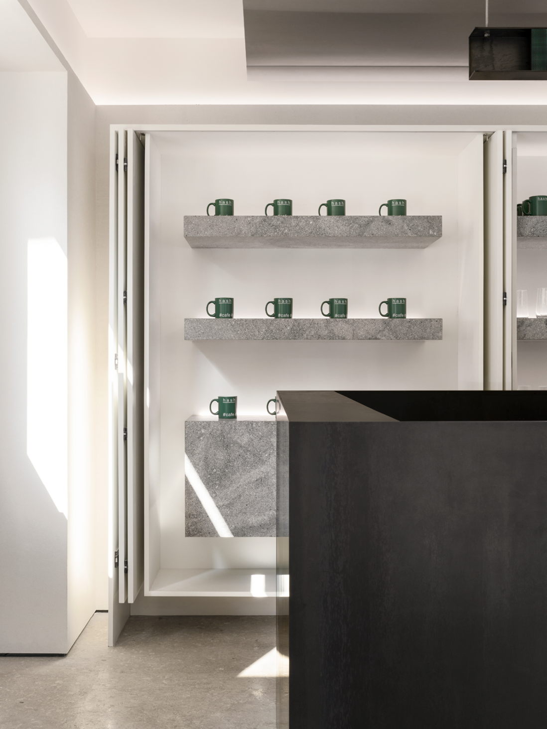
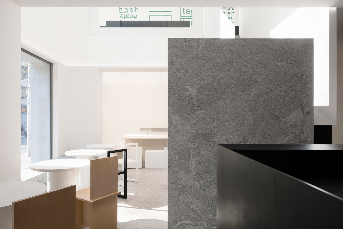
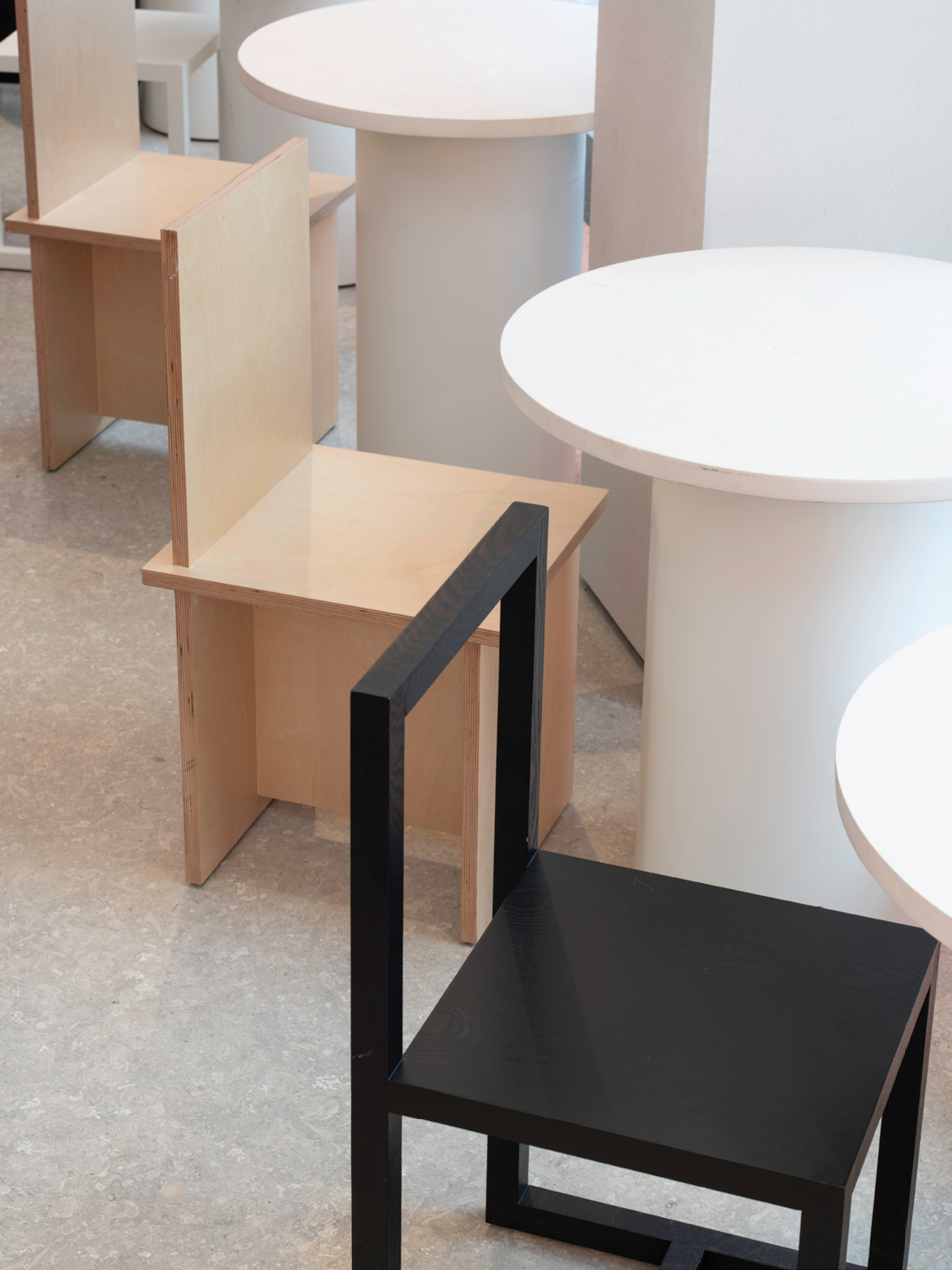
The design team has created a flexible and relaxing space for the guests. All objects in the building except the walls are designed to be independent. From the bar that can be surrounded at the entrance, the storage cabinets that are off the walls, the air-conditioning outlets hanging under the ceilings, to the benches by the windows, or even the dry trash cans that are normally hidden in conventional interior design, all of these items are all placed independently. In the selection of interior materials, the design team used materials with flattened textures matte finish, and pure color. For example, the materials of the bar are made from black hot rolled iron plates and the stairs feature volcanic rocks. At first glance, these materials look like a monochrome surface, but when look closer, these materials show a finer texture.
To create natural light at the end of the first floor, part of the prefabricated roof was removed, and new skylights were added, to visually expand the space with the play of lights. In addition to a dining area and a kitchen, the three spans at the end of the second floor are all defined as exhibition spaces, so the materials of the walls and floors are covered with low–maintenance materials that could be easily restored. The concept of “curating” is gradually being accepted by commercial venues. The store manager wished to use this space as an exhibition venue for artworks and a venue for brand activities. In this Internet era, it seems difficult for commercial spaces to avoid the tag of “Internet–famous site”.
The team has applied different materials for the ground floor and the first floor. The materials that are used for the ground floor have a relatively rough and understated texture. The team used light gray textured sand to mimic the texture of concrete mortar. The exterior of the first floor is redecorated with white paint. The architects aim to make the interior decoration look consistent with the exterior, and the function of the indoor space could be inferred from the exterior. Therefore, the team applied the same texture effect of the exterior design to the indoor space. The implicit and textured materials are carefully selected by the team, in order to equip the entire space with a minimal presence. The ground floor features beige-gray textured sand walls, a limestone floor, and sandstone tables, and the staircase is also made of black volcanic rock and gray granite. Additionally, most of the “equipment” has a matte finish that echoes the minimal theme of the space. The interior design of the first floor also corresponds to its facade with the defining white tone. The first floor is centered on the exhibition space, with white walls and grey self-leveling ground that is commonly used in exhibition spaces.
Since the ground floor will be used as a cocktail bar at nighttime, in a minimalist and inconspicuous space, the lighting design plays an important role. We made a circle of color-adjustable RGBW light strips and luminous film on the walls of the ground floor, and they are set to change to various colors with the change of music. The lights are set to warm white light mode in the daytime and iridescent colors in the night-time. The lighting changes every day, seven days a week, to make this plain and simple space in the daytime transform into a colorful cocktail bar at night. The prop-like arrangement adds a temporary, dynamic experience to the space. At night, the colors of the lights on the ground floor change with music, and people can walk around and talk among these props without having to sit in one place.
In the design of the store, we also use simple and strong contemporary methods to explore some of the experiences outside the image.